
NYFW Aesthetic Highlights from Fall/Winter 2026 are most useful when treated as technique signals rather than trend slogans. The New York shows concluded in February 2026, so the value now, on October 7, 2026, is retrospective: what did the season show about color handling, fabric control, proportion, and styling discipline that makers, students, buyers, and small creative sellers can apply to upcoming work?
The strongest lesson was not that one mood replaced another. The research points to contrast. Dark chromatic dressing sat beside saturated red. Touch-heavy surfaces appeared beside cleaner monochrome styling. Soft sheers and romantic materials were often discussed in relation to structure, not fragility. For technique building, that matters. A designer or stylist cannot rely on color alone; the cut, finish, texture, and layering have to carry the idea.
NYFW Aesthetic Highlights After FW26
NYFW Aesthetic Highlights In Context
NYFW Aesthetic Highlights from FW26 should be read through the specific conditions of that season. According to T-Fashion’s FW26 New York color analysis, black appeared in about 56.4% of womenswear looks, while chocolate brown appeared in about 23.2% T-Fashion color analysis. Those figures do not prove what every consumer bought later, and they should not be treated as a sales forecast. They do show how strongly designers used dark and grounded color families as a runway language.
That language places pressure on technique. Black can flatten a garment if the surface, shape, and seam choices are weak. Chocolate brown can look heavy if the fabric lacks movement or if the styling lacks contrast. In both cases, the eye needs a reason to keep reading the look: a satin against wool, a sharp lapel against a soft knit, a sheer layer under a coat, or a line break that gives the body shape.
What The Color Data Can And Cannot Tell Us
The same T-Fashion report listed white at about 9.6%, midnight blue at about 6.1%, and scarlet at about 3.3%. These smaller shares are still useful. A lower share does not mean a color was unimportant. It may mean the color functioned as punctuation rather than a base. Scarlet, for example, can carry more visual force than its percentage suggests, especially if it appears in a complete look or a high-contrast placement.
For students and independent makers, the practical move is to separate runway presence from production planning. A small capsule does not need to copy runway proportions. It can use the hierarchy as a study tool: dark foundations, brown warmth, controlled white relief, and red as a planned focal decision. That approach keeps the research useful without treating runway data as certainty.
Dark Color Control And Red Statements
Building Depth In Black And Brown
The dominance of black and deep chromatics made craft choices more visible, not less. If a garment is built from black wool, black leather-like surfaces, black satin, or black sheer panels, the viewer reads small differences in reflection, weight, and edge quality. The same principle applies to piano tone: when the palette narrows, control becomes easier to hear. A quiet passage exposes uneven touch; a dark garment exposes weak proportion.
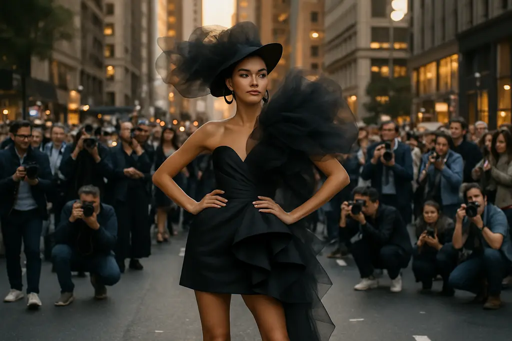
For fashion technique, this means designers need to practice depth in a restrained color field. That can involve pairing matte and gloss, adjusting hem weight, using panel breaks to prevent visual heaviness, and fitting sleeves so the garment does not collapse into a single mass. The NYFW Aesthetic Highlights from FW26 suggest that dark dressing was not passive minimalism. It depended on surface intelligence.
Using Red As Structure, Not Noise
The season also showed red taking a more central position. The Zoe Report described saturated red looks, including ruby, cherry, and crimson tones, in relation to collections from Proenza Schouler, Tory Burch, and Coach The Zoe Report on FW26 trends. The useful point is not simply that red appeared. It is that red could operate as the main statement rather than a trim, shoe, or bag accent.
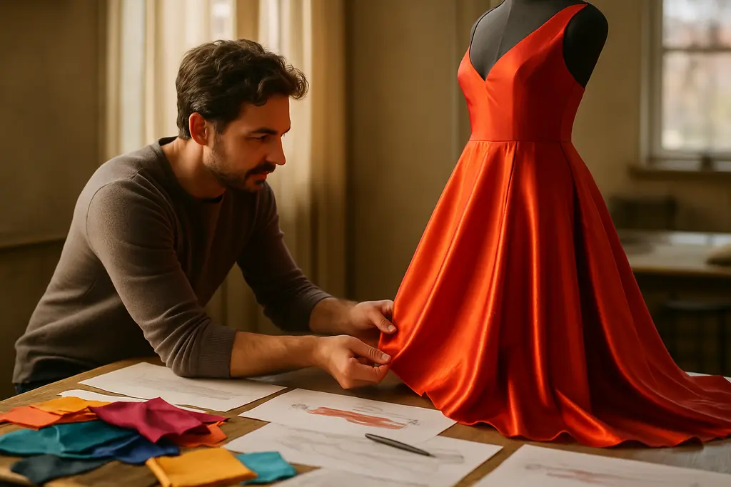
That changes the technical problem. Red fabric often has high visual volume, so the silhouette must be clear. A red coat with vague shoulder shape may overwhelm the wearer. A red knit with poor finishing can look louder than intended. A red dress may need a controlled neckline, sleeve proportion, or fabric weight so the color supports the design rather than shouting over it.
Texture, Sheer Layers, And Volume Technique
Soft Materials Need Firm Decisions
Research notes for FW26 pointed to satin silks, lace, embroidery, feathers, layered draping, and other touch-focused surfaces. Because only some of those observations are tied here to the approved sources, they should be treated as reported runway coverage rather than universal proof of a whole market shift. Still, the technique lesson is sound: texture carries emotion, but it also exposes construction.
Sheer or fluid materials require planning. Chiffon and similar light fabrics can collapse if they are asked to form a strong line without support. Lace can become decorative rather than structural if it is not integrated into the garment. Embroidery and beading can distort fabric if weight distribution is ignored. The stronger FW26 signal was not softness alone; it was softness managed with discipline.
Capes, Drapes, And Construction Pressure
Layered drapes, capelets, shawl-like forms, and shoulder volume appeared in the research notes as part of the FW26 silhouette conversation. These ideas can look effortless from the audience side, but they are demanding in pattern work. Volume has to hang from somewhere. A cape must relate to the neck and shoulder. A poncho-like layer must account for arm movement. A draped coat needs tension points that do not pull the body out of balance.
For technique building, this is where sketching alone is not enough. Makers need muslin tests, shoulder trials, and movement checks. A dramatic swath that photographs well can fail if it restricts walking, sitting, or layering under outerwear. That is why the best lesson from volume is practical: shape must be tested in motion.
Buying And Making Signals For Upcoming Seasons

A Practical Palette Hierarchy
For buyers and small sellers, NYFW Aesthetic Highlights can support planning, but they should not replace knowledge of the actual customer. The runway color hierarchy suggests a cautious structure: build dependable pieces in black and brown, use white or pale contrast sparingly, and treat scarlet or related reds as focused statements. This is a planning model, not a guarantee of demand.
That distinction is especially relevant for creator commerce. A handmade seller may not have the budget to sample every trend. A better approach is to test technique: one black textured accessory, one brown foundational piece, one red statement item, and one mixed-material experiment. The goal is to learn which construction choices hold up, which colors photograph accurately, and which finishes customers understand without heavy explanation.
Creator Commerce Without Copying The Runway
Runway study should not become imitation. Independent makers can learn from color proportion, layering, and texture without copying a designer’s specific garment. That ethical distance matters. It respects the work of designers and keeps the maker focused on transferable technique: seam clarity, fabric pairing, scale, fit, and surface finish.
For a related discussion of runway-informed practice, Kay Granger’s piece on NYFW technique lessons connects fashion observation with studio drills. Those interested in exploring the connections between creative practices in various arts could check the wider network featured at Robsonic, which serves as a useful reference for culture-focused discussions.
- Use black and brown to study depth, not just restraint.
- Treat red as a structural decision with fabric, fit, and finish consequences.
- Pair soft surfaces with clear internal support or sharper outer lines.
- Test volume through movement before presenting it as finished design.
Aesthetic Highlights From New York Fashion Week
Technique Lessons Worth Keeping
The most durable lesson from the February 2026 shows is that aesthetic direction and technical skill cannot be separated. Dark palettes need material contrast. Red needs proportion. Sheer layers need support. Texture needs weight control. Volume needs testing. Monochrome styling needs sharper editing because there is less color variation to hide weak decisions.
NYFW Aesthetic Highlights are most valuable when they sharpen the eye. Rather than asking whether a color or texture is simply in or out, a maker can ask better questions. Does this black fabric show the seam line clearly? Does this brown read warm or muddy? Does this red garment have enough shape to carry the color? Does this sheer layer strengthen the look or merely decorate it? Does the drape move well on a body?
That is the practical meaning of the FW26 season for upcoming work. The runway offered visible signals, but the real training happens in the studio: cutting, pinning, fitting, recording results, and revising. The point is not to chase every trend. The point is to build enough technique to make a limited palette, a strong color, or a difficult fabric feel intentional.