
The Joyful Dressing Trend that emerged from New York Fashion Week Spring/Summer 2027 was not only a mood shift. It was also a technique lesson. The September 10–15, 2026 shows had already concluded by October 12, 2026, so the useful question now is not whether the trend will appear. It did. The better question is how designers built energy through color, proportion, trim, texture, and restraint.
As a technique teacher, I tend to read fashion the way I read a musical phrase: not as a single exciting gesture, but as a chain of decisions. Bright color alone does not make a look successful. Neither does fringe, an oversized accessory, or a playful skirt shape. The craft sits in placement, contrast, pacing, and editing. That is where runway observation becomes useful for makers, stylists, small retailers, and shoppers who want joy without costume-level excess.
How The Joyful Dressing Trend Read On The Runway
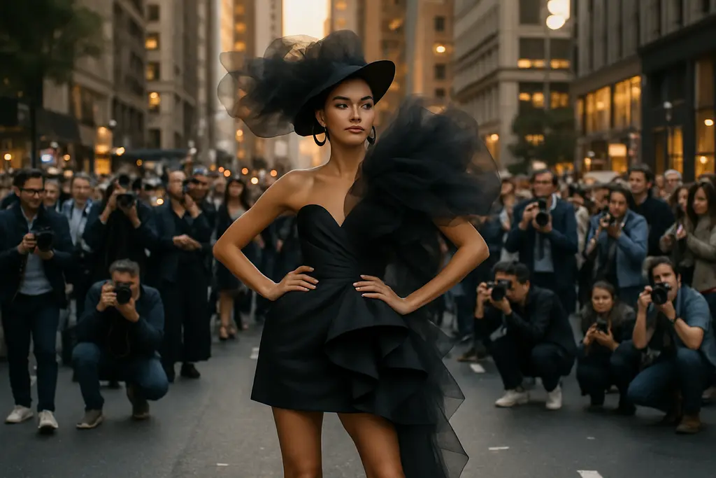
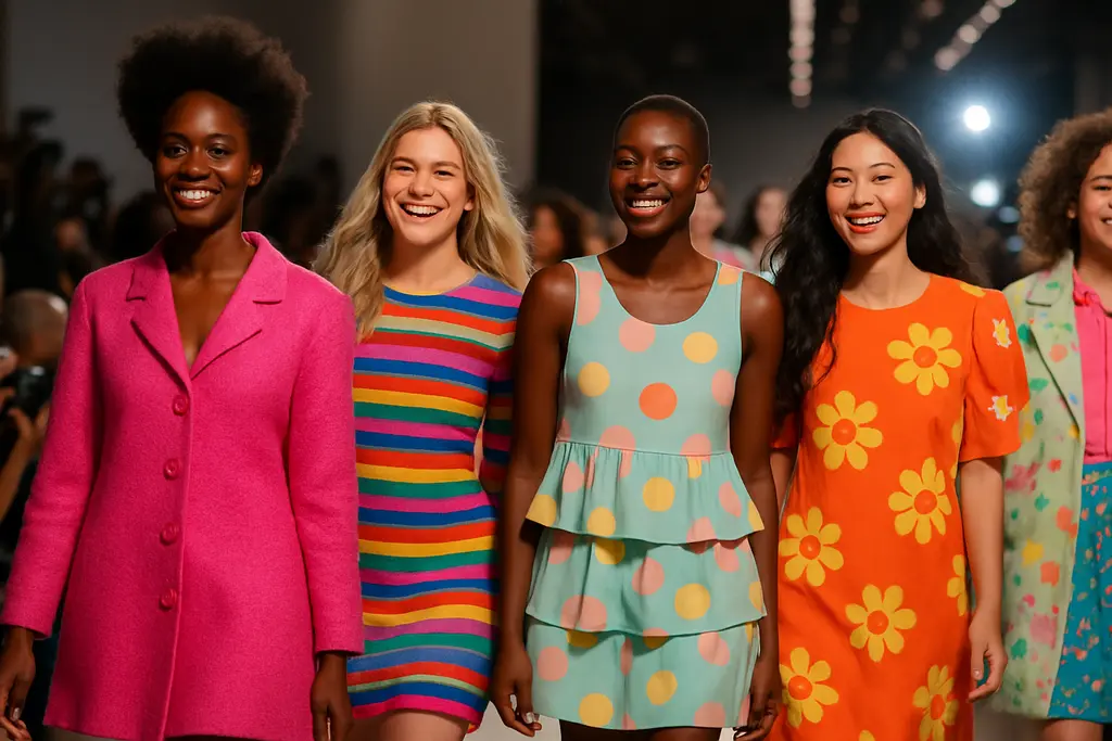
Reports after NYFW SS27 described a visible move toward bright palettes, playful silhouettes, neon trims, oversized accessories, and saturated contrasts, with designers using clothes as a way to signal uplift and escape after more muted fashion cycles. KSAT’s coverage specifically connected the mood to designers including Tory Burch, Ralph Lauren, and Eckhaus Latta, while noting color and texture as key tools in that shift KSAT’s NYFW report.
Color Discipline After The Shows
The most useful reading is not “wear every bright color.” The better lesson is control. A saturated blue, scarlet accent, turquoise piece, or neon trim needs space around it. On a runway, lighting and staging can absorb intensity. In a shop, studio, or everyday wardrobe, that same color may need a neutral garment, a simple shoe, or a repeated accent to feel intentional.
The technical move is similar to practicing a loud passage at the piano: volume works only when the phrase has shape. In fashion terms, that means color should have a job. It can frame the face, sharpen a hemline, signal movement, or create a focal point. If every element asks for attention, the look loses its rhythm.
Joyful Dressing Trend As Technique, Not Costume
The Joyful Dressing Trend can easily be misread as permission to pile on novelty. The SS27 evidence suggests a more balanced reading. Designers used joy through clear devices: contrast, scale, color intensity, and tactile interest. Those devices can be practiced in small steps. A maker might test one exaggerated cuff before building a full-volume sleeve. A seller might buy one scarlet accessory story before committing to a wall of high-saturation inventory.
That is why this trend is useful for technique building. It gives creators a method: choose one expressive feature, support it with structure, then edit anything that competes with it.
Color, Shape, And Restraint
Runway data from T-Fashion’s SS27 New York report complicates the idea that the season was only about loud dressing. White appeared in 32.4% of women’s looks, up from 25.2% in SS26; black appeared in 34.1%, up from 29.0%; scarlet rose to 4.7% from 3.0% across 49 designers. Straight skirts increased from about 4.0% to about 11.5%, while midi skirts rose from about 4.9% to about 11.0% T-Fashion’s NYFW SS27 data.
Reading The Black And White Data
Those black and white figures matter because they show that expressive dressing did not erase minimal-color foundations. Instead, many looks appear to have used familiar grounding colors alongside brighter accents. That is a practical lesson for anyone translating runway language into a rack, a capsule wardrobe, or handmade goods.
Black and white can act like rests in music. They give the eye a place to settle. If a collection includes scarlet, cobalt-leaning blue, turquoise, neon trim, or oversized accessories, neutral space can keep those features readable. For creators, this is a design discipline rather than a retreat from joy.
Skirt Proportions And Wearability
The rise of straight and midi skirts also points to a controlled version of playfulness. These silhouettes can carry strong color or unusual texture without asking the wearer to manage an extreme shape. For small retailers, that matters because a skirt with a clearer line may be easier to merchandise across age groups and styling preferences than a highly theatrical item.
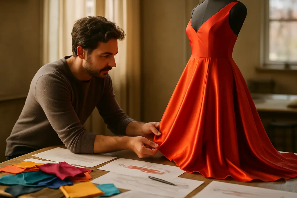
For home sewists and independent makers, straight and midi proportions are useful test grounds. A plain block can become a study in fabric, hem movement, trim placement, or contrast topstitching. The technique lesson is to keep the base legible while allowing one expressive choice to speak.
Texture And Accessory Choices For Makers
Texture is one of the safest ways to learn from runway direction without copying a full designer look. The reported SS27 mood included playful trims and tactile contrasts, but independent creators should avoid reproducing a specific brand’s identifiable combination. A safer technique exercise is to study categories: shine against matte, soft against structured, fringe against a clean edge, or a compact accessory against a larger garment shape.
Contrast Without Copying A Look
For makers, rights and originality deserve caution. A general trend direction, such as saturated color or oversized accessories, is not the same thing as permission to imitate a designer’s distinctive runway outfit. The practical path is to build a personal swatch board: one color family, one texture contrast, one silhouette study, and one accessory scale test. That keeps the work rooted in technique rather than duplication.
A useful studio exercise is to make three samples from the same base: one with a bright trim, one with a tactile surface, and one with a proportion change. Compare them under ordinary daylight, not only under studio lighting. If the piece still reads clearly in a simple setting, the technique is likely stronger.
Buying Notes After NYFW SS27

For shoppers and small retailers, the strongest lesson from the season is selective adoption. The goal is not to purchase every bright or playful item. The goal is to identify which expression fits the customer, maker capacity, or existing wardrobe. For a related retail angle, kaygranger.com has a practical companion piece on smart buying notes for the trend.
A Small Retailer Filter
A cautious buying filter can keep enthusiasm from becoming excess stock. Before committing to a color, trim, or accessory story, ask whether the piece can be styled three ways, whether it sits beside existing neutral inventory, and whether the construction supports the price. Joy should not be used as a cover for weak fabric, poor finishing, or awkward fit.
- Color: Choose one saturated accent group rather than every bright shade at once.
- Silhouette: Test wearable shapes, such as straight or midi skirts, before stronger volume.
- Texture: Use contrast to add interest, not to distract from construction.
- Accessories: Treat oversized scale as a focal point, not a default.
Readers looking to understand the broader implications of fashion movements and how they integrate into daily style choices might find additional perspectives on Next Clues, offering a comparative angle across similar fashion themes and trends.
Joyful Dressing Trend For Technique Building
The best use of the Joyful Dressing Trend is not imitation. It is practice. NYFW SS27 showed that expressive dressing can sit beside black, white, straight skirts, midi lengths, and familiar tailoring ideas. That makes the season more useful than a simple “bright color is back” headline would suggest.
What To Practice Next
For creators, the next exercise is controlled exaggeration. Start with a known pattern, garment block, or product category. Change one variable: color intensity, trim, scale, or texture. Then assess whether the piece still has balance. This is the same principle I use with pianists: change one technical element at a time so you can hear, or in this case see, what actually improved.
The Joyful Dressing Trend deserves attention because it gives makers and buyers a clear design problem. How much pleasure can a garment carry before it loses clarity? The strongest answer is rarely the loudest one. It is the one where color, shape, texture, and proportion support each other with purpose.